'ca.plus': R function for interpretation-oriented Correspondence Analysis scatterplots (DOI: 10.13140/RG.2.1.1630.6966)
'ca.plus' is a R function which allows to plot Correspondence Analysis scatterplots modified to help interpreting the analysis' results. In particular, the function aims at making easier to understand in the same visual context (a) which (say, column) categories are actually contributing to the definition of given pairs of dimensions, and (b) to eyeball which (say, row) categories are more correlated to which dimension. Note: the function has been integrated in the 'CAinterprTools' package (as of version 0.5) described in this same site (LINK).
You may find an example of the scatterplots returned by this function in one of my published articles:
Alberti, G., 2017. New light on old data: Toward understanding settlement and social organization in Middle Bronze Age Aeolian Islands (Sicily) through quantitative and multivariate analysis, Journal of Archaeological Science: Reports 11, 310–29
You may want to read the article (especially pages 317-320) in order to see how this "improved" scatterplot can be used, and in which way it may help the interpretation of correspondence analysis.
The function is :
ca.plus(data, x, y, focus, row.suppl, col.suppl, oneplot, inches, cex)
where
data is a correspondence analysis object returned by the 'FactoMineR' package;
x and y are the dimensions the analyst is interested in (the default value is 1 and 2 respectively);
focus takes "R" if the interest is in assessing the contribution of rows to the definition of the dimensions, "C" if the interest is on the columns;
row.suppl takes TRUE or FALSE if supplementary row data are present or absent (FALSE is the default value);
col.suppl takes TRUE or FALSE if supplementary column data are present or absent (FALSE is the default value);
oneplot takes TRUE or FALSE if the analyst wants the four returned chart on the same page (recommended) or on four separate windows (FALSE is the default value);
inches is numerical and is used to resize the size of the points' bubbles (see below); the default value is 0.35
cex is numerical and is used to set the size of labels' font; the default value is 0.50.
Example:
Let's consider the Greenacre's dataset cross-tabulating university faculties and funding categories.
The dataset (available from my 'CAinterprTools' package), can be loaded into R with the following code:
dataset <- structure(list(A = c(3L, 1L, 6L, 3L, 10L, 3L, 1L, 0L, 2L, 2L), B = c(19L, 2L, 25L, 15L, 22L, 11L, 6L, 12L, 5L, 11L), C = c(39L, 13L, 49L, 41L, 47L, 25L, 14L, 34L, 11L, 37L), D = c(14L, 1L, 21L, 35L, 9L, 15L, 5L, 17L, 4L, 8L), E = c(10L, 12L, 29L, 26L, 26L, 34L, 11L, 23L, 7L, 20L)), .Names = c("A", "B", "C", "D", "E"), class = "data.frame", row.names = c("Geology", "Biochemistry", "Chemistry", "Zoology", "Physics", "Engineering", "Microbiology", "Botany", "Statistics", "Mathematics"))
Let's perform CA by means of the FactoMineR package and store the results on the object called 'res.CA':
res.CA <- CA(dataset, graph=FALSE)
Since we wish to understand the similarities and differences between faculties as far as funding categories are concerned, we decide to focus on the funding categories, i.e. on the columns of the table. In general, we wish to understand which funding category defines (say) the first 2 CA dimensions, and we wish to also understand to which dimension (and, henceforth, funding category) each faculty is more "associated".
This can be easily accomplished with the 'ca.plus' function:
ca.plus(res.CA, 1, 2, focus="C", row.suppl="FALSE", col.suppl="FALSE", oneplot="TRUE")
The output is reproduced below (click on the image to download it in PDF format):
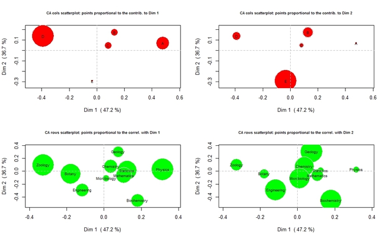
From the top-left plot, it is apparent that funding categories D and A are actually contributing to the definition of the first dimension, while they are not important contributors to the definition of the second dimension, as one can appreciate from the top-right chart. The bottom-left plot is showing that Physics, Mathematics, Statistics, and (to a lesser extent) Biochemistry and Chemistry, are correlated to the positive pole of the first dimension, that is with funding category A. On the other hand, Zoology, Botany, and to a lesser extent Engineering, are more associated to funding category D. From the top-right chart, it can be seen that the negative pole of the second dimension is determined by funding category E, to which Biochemistry and Engineering are strongly associated.
To load the function into R, just copy and paste the function below into the R console, and press return (or you can download the .R file HERE):
To load the function into R, just copy and paste the function below into the R console, and press return (or you can download the .R file HERE):
ca.plus <- function(data,x=1,y=2,focus,row.suppl=FALSE,col.suppl=FALSE,oneplot=FALSE,inches=0.35,cex=0.5){
inrt.perc.x <- round(data$eig[x,2],1)
inrt.perc.y <- round(data$eig[y,2],1)
if (focus=="R") {
cntr.x <- data$row$contrib[,x]
cntr.y <- data$row$contrib[,y]
coord.row.x <- data$row$coord[,x]
coord.row.y <- data$row$coord[,y]
if (col.suppl=="FALSE") {
coord.col.x <- data$col$coord[,x]
coord.col.y <- data$col$coord[,y]
corr.x <- sqrt(data$col$cos2[,x])
corr.y <- sqrt(data$col$cos2[,y])
labs.col <- rownames(data$col$cos2)
} else {
coord.col.x <- rbind(data$col$coord, data$col.sup$coord)[,x]
coord.col.y <- rbind(data$col$coord, data$col.sup$coord)[,y]
corr.x <- sqrt(rbind(data$col$cos2, data$col.sup$cos2))[,x]
corr.y <- sqrt(rbind(data$col$cos2, data$col.sup$cos2))[,y]
labs.col <- rownames(rbind(data$col$cos2, data$col.sup$cos2))
}
radius.cntr.x <- sqrt(cntr.x/pi)
radius.cntr.y <- sqrt(cntr.y/pi)
radius.corr.x <- sqrt(corr.x/pi)
radius.corr.y <- sqrt(corr.y/pi)
labs.row <- rownames(data$row$contrib)
title.cntr.x <- paste("CA rows scatterplot: points proportional to the contrib. to Dim", x)
title.cntr.y <- paste("CA rows scatterplot: points proportional to the contrib. to Dim", y)
title.corr.x <- paste("CA columns scatterplot: points proportional to the correl. with Dim", x)
title.corr.y <- paste("CA columns scatterplot: points proportional to the correl. with Dim", y)
if (oneplot=="TRUE") {
par(mfrow=c(2,2))
} else {}
symbols(coord.row.x, coord.row.y, circles=radius.cntr.x, inches=inches, fg="white", bg="red", xlab=paste("Dim",x," (", inrt.perc.x, "%)"), ylab=paste("Dim",y, " (", inrt.perc.y, "%)"), main=title.cntr.x, cex.main=0.70)
text(coord.row.x, coord.row.y, labs.row, cex=cex)
abline(v=0, lty=2, col="grey")
abline(h=0, lty=2, col="grey")
if (row.suppl=="TRUE") {
points(data$row.sup$coord[,x],data$row.sup$coord[,y])
text(data$row.sup$coord[,x],data$row.sup$coord[,y], rownames(data$row.sup$coord), cex=cex, pos=3)
} else {}
symbols(coord.row.x, coord.row.y, circles=radius.cntr.y, inches=inches, fg="white", bg="red", xlab=paste("Dim",x," (", inrt.perc.x, "%)"), ylab=paste("Dim",y, " (", inrt.perc.y, "%)"), main=title.cntr.y, cex.main=0.70)
text(coord.row.x, coord.row.y, labs.row, cex=cex)
abline(v=0, lty=2, col="grey")
abline(h=0, lty=2, col="grey")
if (row.suppl=="TRUE") {
points(data$row.sup$coord[,x],data$row.sup$coord[,y])
text(data$row.sup$coord[,x],data$row.sup$coord[,y], rownames(data$row.sup$coord), cex=cex, pos=3)
} else {}
symbols(coord.col.x, coord.col.y, circles=radius.corr.x, inches=inches, fg="white", bg="green", xlab=paste("Dim",x," (", inrt.perc.x, "%)"), ylab=paste("Dim",y, " (", inrt.perc.y, "%)"), main=title.corr.x, cex.main=0.70)
text(coord.col.x, coord.col.y, labs.col, cex=cex)
abline(v=0, lty=2, col="grey")
abline(h=0, lty=2, col="grey")
symbols(coord.col.x, coord.col.y, circles=radius.corr.y, inches=inches, fg="white", bg="green", xlab=paste("Dim",x," (", inrt.perc.x, "%)"), ylab=paste("Dim",y, " (", inrt.perc.y, "%)"), main=title.corr.y, cex.main=0.70)
text(coord.col.x, coord.col.y, labs.col, cex=cex)
abline(v=0, lty=2, col="grey")
abline(h=0, lty=2, col="grey")
par(mfrow=c(1,1))
} else {
cntr.x <- data$col$contrib[,x]
cntr.y <- data$col$contrib[,y]
coord.col.x <- data$col$coord[,x]
coord.col.y <- data$col$coord[,y]
if (row.suppl=="FALSE") {
coord.row.x <- data$row$coord[,x]
coord.row.y <- data$row$coord[,y]
corr.x <- sqrt(data$row$cos2[,x])
corr.y <- sqrt(data$row$cos2[,y])
labs.row <- rownames(data$row$cos2)
} else {
coord.row.x <- rbind(data$row$coord, data$row.sup$coord)[,x]
coord.row.y <- rbind(data$row$coord, data$row.sup$coord)[,y]
corr.x <- sqrt(rbind(data$row$cos2, data$row.sup$cos2))[,x]
corr.y <- sqrt(rbind(data$row$cos2, data$row.sup$cos2))[,y]
labs.row <- rownames(rbind(data$row$cos2, data$row.sup$cos2))
}
radius.cntr.x <- sqrt(cntr.x/pi)
radius.cntr.y <- sqrt(cntr.y/pi)
radius.corr.x <- sqrt(corr.x/pi)
radius.corr.y <- sqrt(corr.y/pi)
labs.col <- rownames(data$col$contrib)
title.cntr.x <- paste("CA cols scatterplot: points proportional to the contrib. to Dim", x)
title.cntr.y <- paste("CA cols scatterplot: points proportional to the contrib. to Dim", y)
title.corr.x <- paste("CA rows scatterplot: points proportional to the correl. with Dim", x)
title.corr.y <- paste("CA rows scatterplot: points proportional to the correl. with Dim", y)
if (oneplot=="TRUE") {
par(mfrow=c(2,2))
} else {}
symbols(coord.col.x, coord.col.y, circles=radius.cntr.x, inches=inches, fg="white", bg="red", xlab=paste("Dim",x," (", inrt.perc.x, "%)"), ylab=paste("Dim",y, " (", inrt.perc.y, "%)"), main=title.cntr.x, cex.main=0.70)
text(coord.col.x, coord.col.y, labs.col, cex=cex)
abline(v=0, lty=2, col="grey")
abline(h=0, lty=2, col="grey")
if (col.suppl=="TRUE") {
points(data$col.sup$coord[,x],data$col.sup$coord[,y])
text(data$col.sup$coord[,x],data$col.sup$coord[,y], rownames(data$col.sup$coord), cex=cex, pos=3)
} else {}
symbols(coord.col.x, coord.col.y, circles=radius.cntr.y, inches=inches, fg="white", bg="red", xlab=paste("Dim",x," (", inrt.perc.x, "%)"), ylab=paste("Dim",y, " (", inrt.perc.y, "%)"), main=title.cntr.y, cex.main=0.70)
text(coord.col.x, coord.col.y, labs.col, cex=cex)
abline(v=0, lty=2, col="grey")
abline(h=0, lty=2, col="grey")
if (col.suppl=="TRUE") {
points(data$col.sup$coord[,x],data$col.sup$coord[,y])
text(data$col.sup$coord[,x],data$col.sup$coord[,y], rownames(data$col.sup$coord), cex=cex, pos=3)
} else {}
symbols(coord.row.x, coord.row.y, circles=radius.corr.x, inches=inches, fg="white", bg="green", xlab=paste("Dim",x," (", inrt.perc.x, "%)"), ylab=paste("Dim",y, " (", inrt.perc.y, "%)"), main=title.corr.x, cex.main=0.70)
text(coord.row.x, coord.row.y, labs.row, cex=cex)
abline(v=0, lty=2, col="grey")
abline(h=0, lty=2, col="grey")
symbols(coord.row.x, coord.row.y, circles=radius.corr.y, inches=inches, fg="white", bg="green", xlab=paste("Dim",x," (", inrt.perc.x, "%)"), ylab=paste("Dim",y, " (", inrt.perc.y, "%)"), main=title.corr.y, cex.main=0.70)
text(coord.row.x, coord.row.y, labs.row, cex=cex)
abline(v=0, lty=2, col="grey")
abline(h=0, lty=2, col="grey")
par(mfrow=c(1,1))
}
}
Have you found this website helpful? Consider to leave a comment in this page.
