'ppd.plot': R function to plot a Posterior Probability Density plot for Bayesian modeled 14C dates (DOI: 10.13140/RG.2.1.3844.3285).
The function's parameters are the following:
ppd.plot(data, lower, upper, type)
where
data is a dataframe fed into R containing the data as derived from the OxCal program;
lower is the lower limit of the calendar date axis;
upper is the upper limit of the calendar date axis;
type is the type of plot the user wishes to plot (a: curves outlined by a line; b: curves plotted as solid areas; c: combination of a and b).
If the lower and upper parameters are not provided by the user, the default values will be the earliest and latest calendar dates. These values can be modified, as shown further below.
The dataframe (download a sample dataset here) must be organized as follows (it is rather easy to do that once the data have been exported from OxCal):
-calendar dates (first column to the left)
-posterior probabilities (second column)
-grouping variables (third column), which could contain the names of the events of interest (e.g., phase 1 start, phase 1 end, phase 2 start, phase 2 end, etc).
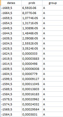
Example of dataframe organization
|
|

|
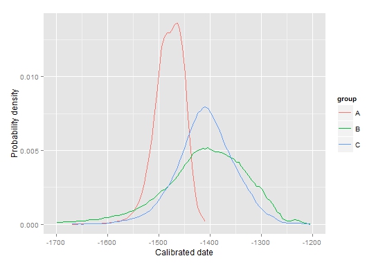
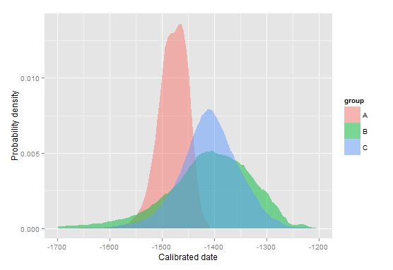
With reference to the above images (representing the posterior probability density for the starting boundaries of three fictional archaeological phases), the following parameters have been used:
ppd.plot(mydata, -1700,-1200,type="a") (top-left picture)
ppd.plot(mydata, -1700,-1200,type="b") (bottom-left picture)
ppd.plot(mydata, -1700,-1200,type="c") (right picture)
Now, it is time to load the function into R. Just copy and paste the function below into the R console, and press return. Alternatively, you can download the file by clicking HERE.
Final note: in order for the function to produce the above chart, the 'ggplot2' package must be installed in R. The function will automatically check if the package is already installed on your computer, otherwise it will attempt to install and load it.
ppd.plot <- function(data,lower=min(data[,1]),upper=max(data[,1]),type) {
if(require(ggplot2)){
print("ggplot2 package already installed. Good!")
} else {
print("trying to install ggplot2 package...")
install.packages("ggplot2", dependencies=TRUE)
suppressPackageStartupMessages(require(ggplot2))
}
if (type == "a") {
a <- ggplot(data=data) + geom_line(aes(x=data[,1],y=data[,2],color=data[,3])) + scale_x_continuous(limits =c(lower,upper)) + xlab("Calibrated date") + ylab("Probability density") + labs(color="Events")
print(a)
} else {
if (type == "b") {
b <- ggplot(data=data) + geom_area(position="identity", aes(x=data[,1],y=data[,2],fill=data[,3]), alpha=0.5) + scale_x_continuous(limits =c(lower,upper)) + xlab("Calibrated date") + ylab("Probability density") + labs(fill="Events")
print(b)
} else {
if (type == "c") {
a <- ggplot(data=data) + geom_line(aes(x=data[,1],y=data[,2],color=data[,3])) + scale_x_continuous(limits =c(lower,upper)) + xlab("Calibrated date")
c <- a + geom_area(position="identity",aes(x=data[,1],y=data[,2],fill=data[,3]), alpha=0.5) + xlab("Calibrated date") + ylab("Probability density") + labs(fill="Events") + guides(color=FALSE)
print(c)
}
}
}
}
Have you found this website helpful? Consider to leave a comment in this page.
