'plot.mw': R function for visually displaying Mann-Whitney test's results (DOI: 10.13140/RG.2.1.4630.7601)
'plot.mw' is an R function which allows to perform Mann-Whitney test, and to display the test's results in a plot along with two boxplots. For information about the test, and on what it is actually testing, see for instance the interesting article by R M Conroy, What hypotheses do "nonparametric" two-group tests actually test?, in The Stata Journal 12 (2012): 1-9. A sample dataset (in .txt format) can be downloaded HERE. The dataset contains some measurements in the first column, and a grouping variable in the second one. This is the format in which data must be fed into the function.
The function is quite straightforward:
plot.mw(data, strip, notch, omm, outl, HL)
where:
data is the dataframe containing the data (arranged according to what has been described just few lines above);
strip is a logical value which takes FALSE (by default) or TRUE if the user wants jittered points to represent individual values;
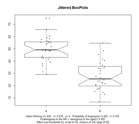
notch is a logical value which takes FALSE (by default) or TRUE if user does not or do want to have notched boxplots in the final display, respectively; it is worth noting that overlapping of notches indicates a not significant difference at about 95% confidence (see McGill R, Tukey JW, Larsen WA, Variations of Box Plots, in The American Statistician 32 (1978): 12–16);
omm (which stands for overall mean and median) takes FALSE (by default) or TRUE if user wants the mean and median of the overall sample plotted in the chart (as a dashed RED line and dotted BLUE line respectively);
oul is a logical value which takes FALSE or TRUE (by default) if users want the boxplots to display outlying values;
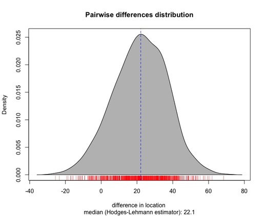
HL is a logical value that takes TRUE or FALSE (default) if the user wants to diplay the distribution of the pairwise differences between the values of the two samples being compared; the median of that distribution is the Hodges-Lehmann estimator.
With reference to the illustrative dataset cited above, the function allows to get the plots below:
The function is quite straightforward:
plot.mw(data, strip, notch, omm, outl, HL)
where:
data is the dataframe containing the data (arranged according to what has been described just few lines above);
strip is a logical value which takes FALSE (by default) or TRUE if the user wants jittered points to represent individual values;
notch is a logical value which takes FALSE (by default) or TRUE if user does not or do want to have notched boxplots in the final display, respectively; it is worth noting that overlapping of notches indicates a not significant difference at about 95% confidence (see McGill R, Tukey JW, Larsen WA, Variations of Box Plots, in The American Statistician 32 (1978): 12–16);
omm (which stands for overall mean and median) takes FALSE (by default) or TRUE if user wants the mean and median of the overall sample plotted in the chart (as a dashed RED line and dotted BLUE line respectively);
oul is a logical value which takes FALSE or TRUE (by default) if users want the boxplots to display outlying values;
HL is a logical value that takes TRUE or FALSE (default) if the user wants to diplay the distribution of the pairwise differences between the values of the two samples being compared; the median of that distribution is the Hodges-Lehmann estimator.
With reference to the illustrative dataset cited above, the function allows to get the plots below:
|
|
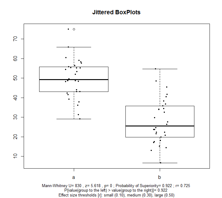
The boxplots display the distribution of the values of the two samples (here labelled a and b), and jittered points represent the individual observations. At the bottom of the chart, a subtitle arranged on three lines reports relevant statistics:
-test statistic (namely, U) and the associated z and p value;
-Probability of Superiority value (which can be interpreted as an effect-size measure, as discussed HERE); in this case, as reported in the second line of the subtitle, the probability of observing a number (randomly drawn) from sample a being larger than a (randomly drawn) number from sample b is 0.92;
-another measure of effect size, namely r (see HERE), whose thresholds are indicated in the last line of the plot's subtitle.
The density plot (coupled with a rug plot at the botton of the same chart) displays the distribution of the pairwise differences between the values of the two samples being compared. The median of this distribution (which is represented by a blue reference line in the same chart) corresponds to the Hodges-Lehmann estimator.
Please note that, in order for the function to work, two packages must be already installed in R: 'plyr' and 'coin'.
|
You can get the function via a small donation (about a couple of USD) -------------->
|
|
Upon making your donation, please do not forget to provide your preferred email contact where you will receive the file.
Have you found this website helpful? Consider to leave a comment in this page.
