'scalar.stress': R function for scalar stress calculation (DOI: 10.13140/RG.2.1.1943.7841)
'scalar.stress' is an R function which allows to calculate probability that a community reached a critical level of scalar stress, on the basis of its community size. For a in-deep discussion of the theoretical background and of the rationale on which the calculation is based (namely, a Logistic Regression model base on data for Hutterite communities fission), see my 2014 article Modeling Group Size and Scalar Stress by Logistic Regression from an Archaeological Perspective in PLoS ONE 9(3): e91510. doi:10.1371/journal.pone.0091510 (see HERE and HERE).
The function is quite straightforward:
scalar.stress(x)
where x is the community size.
scalar.stress(x)
where x is the community size.
The function returns:
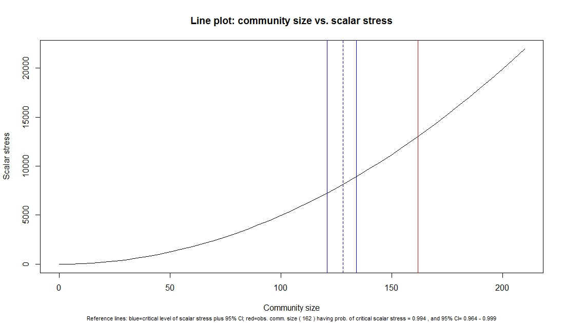
a) a chart representing: the scalar stress as function of increasing community size; the critical community size threshold with its 95% confidence interval (blue lines) and the observed community size (i.e., the value of x fed into the function); at the bottom of the chart, the observed community size, the point estimate of the probability of critical scalar stress (and its 95% confidence interval) are reported. This last piece of information is visually represented in the second returned chart, described below;
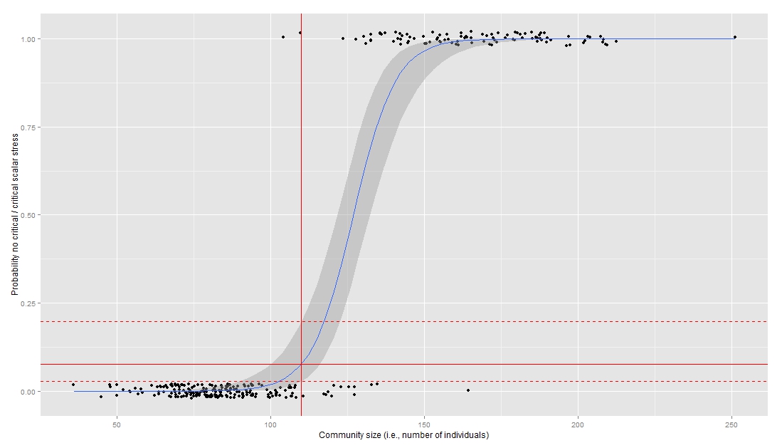
b) a second chart represents the probability of critical scalar stress as (logistic) function of community size on the basis of the Hutterites' community size data; a vertical red line indicate the observed community size, while three horizontal lines represent the point estimate and its 95% confidence interval [dashed lines] for the probability of critical scalar stress.
Take a look at the chart below, produced using community size 110 and 162 respectively (click to enlarge):
a) a chart representing: the scalar stress as function of increasing community size; the critical community size threshold with its 95% confidence interval (blue lines) and the observed community size (i.e., the value of x fed into the function); at the bottom of the chart, the observed community size, the point estimate of the probability of critical scalar stress (and its 95% confidence interval) are reported. This last piece of information is visually represented in the second returned chart, described below;
b) a second chart represents the probability of critical scalar stress as (logistic) function of community size on the basis of the Hutterites' community size data; a vertical red line indicate the observed community size, while three horizontal lines represent the point estimate and its 95% confidence interval [dashed lines] for the probability of critical scalar stress.
Take a look at the chart below, produced using community size 110 and 162 respectively (click to enlarge):
|

|
The function can be downloaded HERE.
Final note:
in order for the function to produce the above chart, the 'ggplot2' package must be installed in R. The function will automatically check if the package is already installed on your computer, otherwise it will attempt to install and load it.
in order for the function to produce the above chart, the 'ggplot2' package must be installed in R. The function will automatically check if the package is already installed on your computer, otherwise it will attempt to install and load it.
Have you found this website helpful? Consider to leave a comment in this page.
