'log.regr': R function for easy binary Logistic Regression and model diagnostics (DOI: 10.13140/RG.2.2.11462.27201)
|
'log.regr' is an R function which allows to make it easy to perform binary Logistic Regression, and to graphically display the estimated coefficients and odds ratios. It also allows to visually check model's diagnostics such as outliers, leverage, and Cook's distance.
The function is straightforward: log.regr(data, oneplot) where: data: is the dataframe containing the dataset, with the Dependent Variable listed in the first column to the left; oneplot: logical value which takes TRUE or FALSE (default) if the user does or doesn't want to group the first set of 8 charts in one panel. |
|
For illustrative purpose, we will use the fictional dataset (downloadable HERE; just copy/paste the file content in the R console and hit return) related to the example 2 examined in this interesting webpage (LINK). The question we wish to address is how 3 variables, such as GRE (Graduate Record Exam scores), GPA (grade point average) and prestige of the undergraduate institution, effect admission into graduate school. The dependent variable, admit/don't admit, is a binary variable, coded as 1 and 0 respectively.
Supposing we stored the dataset into an object called mydata, to put the function to work we simply use:
log.regr(mydata)
The function may take a while (just matter of few seconds) to completed all the operations, and will eventually return the nine charts below (click on each single picture if you want to visualize it in a larger format).
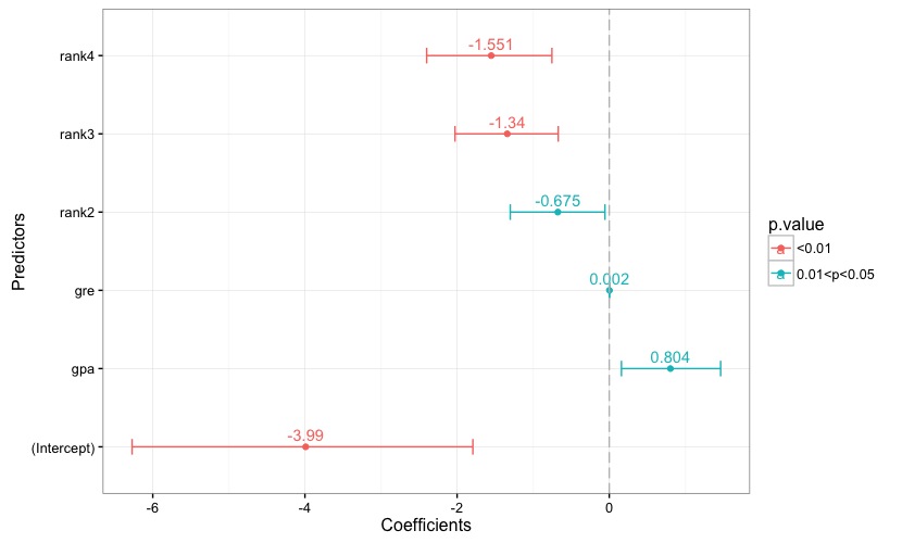
Fig. 1
|

Fig. 2
|
Fig. 1 reports the estimated coefficients, along with each coefficient's confidence interval. A reference line is set to 0. Each bar is given a color according to the associated p-value, and the key to the color scale is reported in the chart's legend. The same applies to the chart in Fig. 2, which reports the odds ratios and their confidence intervals.
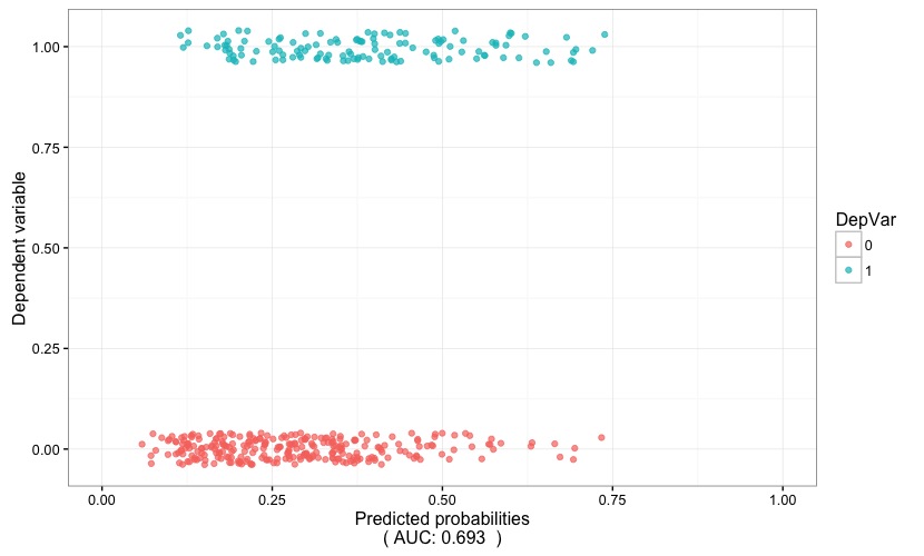
Fig. 3
|
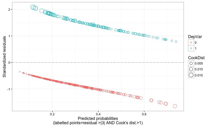
Fig. 4
|
Fig. 3 is helpful in visually gauging the discriminatory power of the model: the predicted probability (x axis) are plotted against the dependent variable (y axis). If the model proves to have a high discriminatory power, the two stripes of points will tend to be well separated, i.e. the positive outcome of the dependent variable (points with color corresponding to 1) would tend to cluster around high values of the predicted probability, while the opposite will hold true for the negative outcome of the dependent variable (points with color corresponding to 0). In this case, the AUC (which is reported at the bottom of the chart) points to a low discriminatory power.
Fig. 4 displays the model's standardized (Pearson's) residuals against the predicted probability. The size of the points is proportional to the Cook's distance, and problematic points would be flagged by a label reporting their observation number if the following two conditions happen: residual value larger than 3 (in terms of absolute value) AND Cook's distance larger than 1. Recall that an observation is an outlier if it has a response value that is very different from the predicted value based on the model. But, being an outlier doesn't automatically imply that that observation has a negative effect on the model; for this reason, it is good to also check for the Cook's distance, which quantifies how influential is an observation on the model's estimates. Cook's distance should not be larger than 1.
Fig. 4 displays the model's standardized (Pearson's) residuals against the predicted probability. The size of the points is proportional to the Cook's distance, and problematic points would be flagged by a label reporting their observation number if the following two conditions happen: residual value larger than 3 (in terms of absolute value) AND Cook's distance larger than 1. Recall that an observation is an outlier if it has a response value that is very different from the predicted value based on the model. But, being an outlier doesn't automatically imply that that observation has a negative effect on the model; for this reason, it is good to also check for the Cook's distance, which quantifies how influential is an observation on the model's estimates. Cook's distance should not be larger than 1.
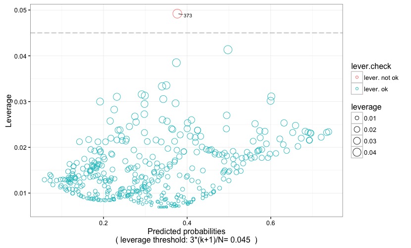
Fig. 5
|
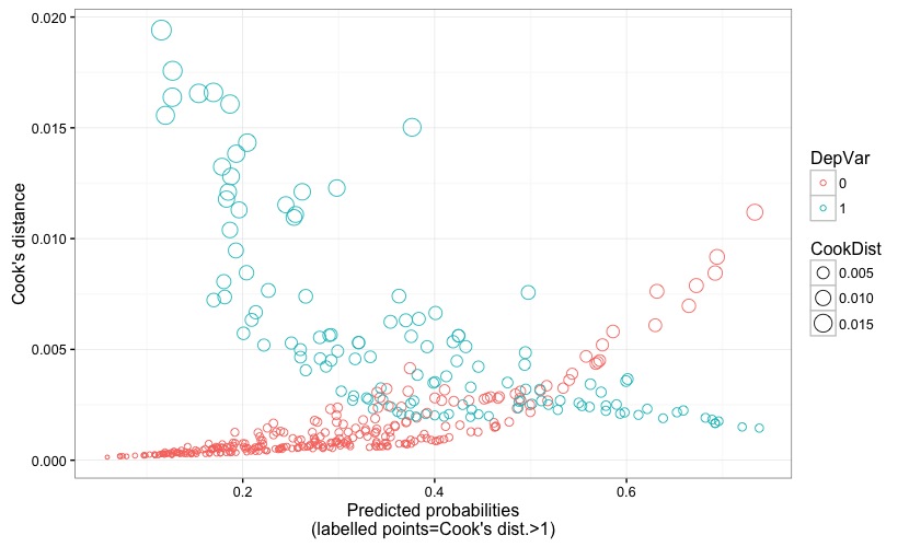
Fig. 6
|
In Fig. 5 the predicted probability is plotted against the leverage value. Dots represent observations, and their size is proportional to their leverage value, and their color is coded according to whether or not the leverage is above (lever. not ok) or below (lever. ok) the critical threshold. The latter is represented by a grey reference line, and is also reported at the bottom of the chart itself. An observation has high leverage if it has a particularly unusual combination of predictor values. Observations with high leverage are flagged with their observation number, making it easy to spot them within the dataset. Remember that values with high leverage and/or with high residual may be potential influencial points and may potentially negatively impact the regression. We will return on this when examining the following two plots. As for the leverage threshold, it is set at 3*(k+1)/N (following Pituch-Stevens, Applied Multivariate Statistics for the Social Science. Analyses with SAS and IBM's SPSS, Routledge: New York 2016), where k is the number of predictors and N is the sample size.
Fig. 6 displays the predicted probability against the Cook's distance, to which reference has been made earlier when describing Fig. 4.
Fig. 6 displays the predicted probability against the Cook's distance, to which reference has been made earlier when describing Fig. 4.

Fig. 7
|
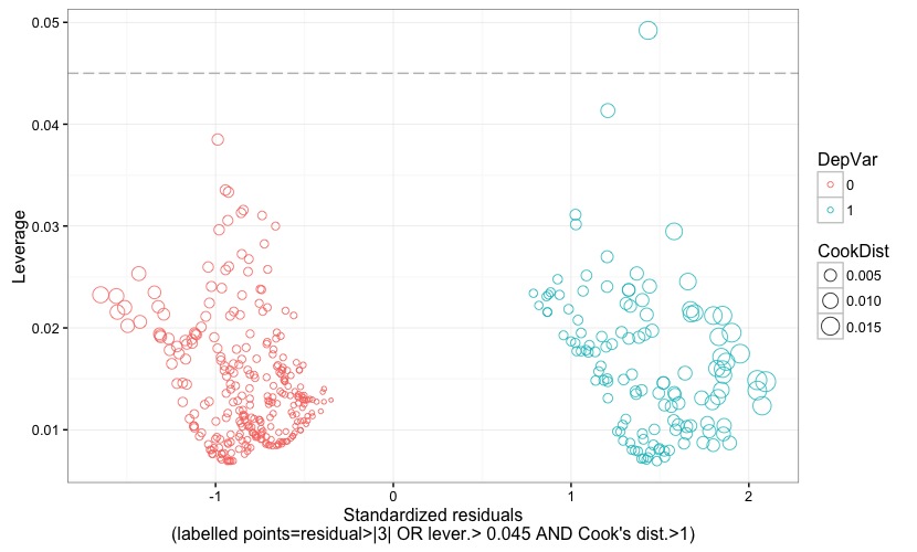
Fig. 8
|
Fig. 7 displays the standardized (Pearson's) residuals against the leverage. Points representing observations with positive or negative outcome of the dependent variable are given different colors. Further, points' size is proportional to the Cook's distance. Leverage threshold is indicated by a grey reference line, and the threshold value is also reported at the bottom of the chart. Observations are flagged with their observation number if their residual is larger than 3 (in terms of absolute value) OR if leverage is larger than the critical threshold OR if Cook's distance is larger than 1. This allows to easily check which observation turns out to be an outlier or a high-leverage data point or an influential point, or a combination of the three.
Fig. 8 is almost the same as the preceding figure, except for the way in which observations are flagged. In fact, they are flagged if the residual is larger than 3 (again, in terms of absolute value) OR if the leverage is higher than the critical threshold AND if a Cook's distance larger than 1 plainly declares them as having a high influence on the model's estimates. As made clear, for instance, in Lesson 11: Influential Points (STAT 501-Regression Methods, Penn Sate, Eberly College of Science):
Fig. 8 is almost the same as the preceding figure, except for the way in which observations are flagged. In fact, they are flagged if the residual is larger than 3 (again, in terms of absolute value) OR if the leverage is higher than the critical threshold AND if a Cook's distance larger than 1 plainly declares them as having a high influence on the model's estimates. As made clear, for instance, in Lesson 11: Influential Points (STAT 501-Regression Methods, Penn Sate, Eberly College of Science):
|
"...there is a distinction between outliers and high leverage observations, and each can impact our regression analyses differently. It is also possible for an observation to be both an outlier and have high leverage. Thus, it is important to know how to detect outliers and high leverage data points. Once we've identified any outliers and/or high leverage data points, we then need to determine whether or not the points actually have an undue influence on our model."
|
Since an observation may be either an outlier or a high-leverage data point, or both, and yet not being influential, the chart in Fig. 8 allows to spot observations that have an undue influence on our model, regardless of them being either outliers or high-leverage data points, or both.
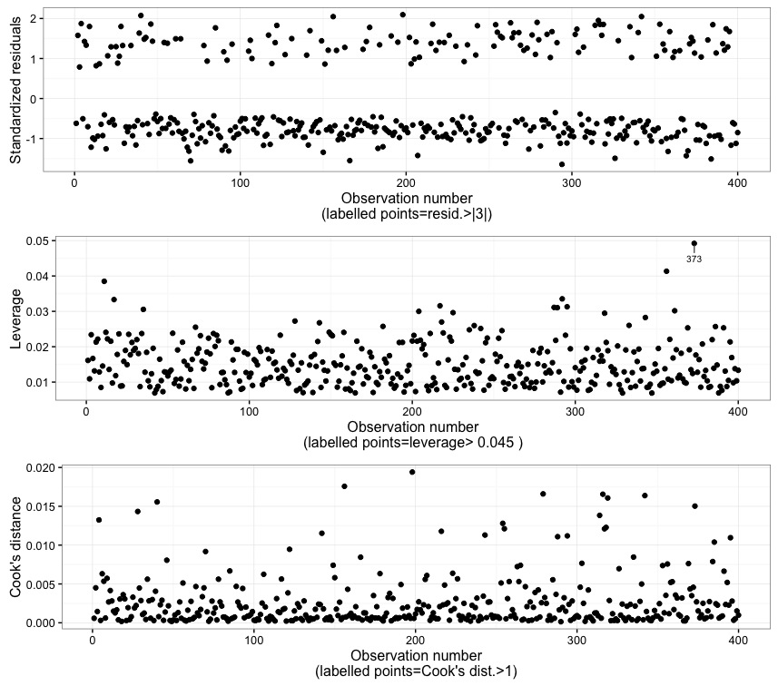
Fig. 9
In Fig. 9 the observation numbers are plotted against the standardized (Pearson's) residuals, the leverage, and the Cook's distance. Points are labelled according to the rationales explained in the preceding corresponding charts. By the way, the rationale is also explained at the bottom of each plots. In this case, it can be seen that observation 373 has a high leverage, but it turns out to not be an outlier and, more importantly, it is not declared influential according to the Cook's distance.
Finally, the function will return two objects: one in named fit, and actually contains the model's results; the second is names frm and stores the formula used for the logistic regression, and can be used for further modelling procedures into R.
The function can be downloaded HERE, or you can copy/paste the code below into the R console. In order for the function to work properly, the 'ggplot2', 'ggrepel', 'gridExtra', and 'plyr' packages must be already installed and loaded into R.
log.regr <- function(data,oneplot=FALSE){
options(scipen=999)
DV_name <-names(data[1])
IV_names <- names(data)[names(data) != DV_name]
IV_group <- paste(IV_names, collapse="+")
frm <<- as.formula(paste(DV_name, "~", IV_group, sep = ""))
fit <<- glm(frm, data=data, family=binomial(logit))
print(summary(fit))
coeff <- cbind(coef = coef(fit), confint(fit))
df.coeff <- data.frame(Predictors=dimnames(coeff)[[1]], Coefficient_Estimate=coeff[,1], cf_lcl=coeff[,2], cf_ucl=coeff[,3], p=coef(summary(fit))[,4])
df.coeff$p.value <- ifelse(df.coeff$p < 0.01,"<0.01",ifelse(df.coeff$p < 0.05,"0.01<p<0.05",ifelse(df.coeff$p < 0.1,"0.05<p<0.1", ">0.1")))
p1 <- ggplot(df.coeff, aes(x=Coefficient_Estimate, y=Predictors, color=p.value, label=round(Coefficient_Estimate,3))) + geom_point() + geom_errorbarh(aes(xmax = cf_ucl, xmin = cf_lcl, height = .2)) + geom_text(vjust = 0, nudge_y = 0.08) + geom_vline(xintercept = 0, colour="grey", linetype = "longdash") + theme_bw() + labs(x = "Coefficients", y="Predictors")
print(coeff)
odds <- cbind(OR = exp(coef(fit)), exp(confint(fit)))
df.odds <- data.frame(Predictors=dimnames(odds)[[1]], Odds_Ratio=odds[,1], or_lcl=odds[,2], or_ucl=odds[,3], p=coef(summary(fit))[,4])
df.odds.to.use <- df.odds[-1,]
df.odds.to.use$p.value <- ifelse(df.odds.to.use$p < 0.01,"<0.01",ifelse(df.odds.to.use$p < 0.05,"0.01<p<0.05", ifelse(df.odds.to.use$p < 0.1, "0.05<p<0.1",">0.1")))
p2 <- ggplot(df.odds.to.use, aes(x=Odds_Ratio, y=Predictors, color=p.value, label=round(Odds_Ratio,3))) + geom_point() + geom_errorbarh(aes(xmax = or_ucl, xmin = or_lcl, height = .2)) + geom_text(vjust = 0, nudge_y = 0.08) + geom_vline(xintercept = 1, colour="grey", linetype = "longdash") + theme_bw() + labs(x = "Odds ratios", y="Predictors")
print(odds)
df.diagn <- data.frame(point_lbl=as.numeric(rownames(data)), y=fit$y, pred.prob=fit$fitted.values, res=rstandard(fit), CookDist=cooks.distance(fit), DepVar=as.factor(fit$y), leverage=hatvalues(fit))
n.of.predictors <- sum(hatvalues(fit))-1 #get the number of parameters (ecluding the intercept); it takes into account the levels of dummy-coded predictors if present
lev.thresh <- round(3*((n.of.predictors+1)/nrow(data)),3)
df.diagn$lever.check <- ifelse(df.diagn$leverage>lev.thresh,"lever. not ok","lever. ok")
obs_per_factor <- count(df.diagn$DepVar) # requires 'plyr'
U <- wilcox.test(df.diagn$pred.prob ~ df.diagn$DepVar)$statistic
auc <- round(1-U/(obs_per_factor$freq[1]*obs_per_factor$freq[2]), 3)
p3 <- ggplot(df.diagn, aes(x=pred.prob, y=y, color=DepVar)) + geom_jitter(position=position_jitter(h=0.1), alpha=0.70) + xlim(0,1) + theme_bw() + labs(x = paste("Predicted probability\n( AUC:", auc, " )"), y="Dependent variable")
p4 <- ggplot(df.diagn, aes(x=pred.prob, y=res, color=DepVar, label=point_lbl)) + geom_point(aes(size = CookDist), shape=1, alpha=.90) + geom_hline(yintercept = 0, colour="grey", linetype = "longdash") + theme_bw() + geom_text_repel(data = subset(df.diagn, abs(res) > 3 & CookDist > 1), aes(label = point_lbl), size = 2.7, colour="black", box.padding = unit(0.35, "lines"), point.padding = unit(0.3, "lines")) + labs(x = "Predicted probability\n(labelled points=residual >|3| AND Cook's dist.>1)", y="Standardized residuals") #requires 'ggrepel'
p5 <- ggplot(df.diagn, aes(x=pred.prob, y=leverage, color=lever.check)) + geom_point(aes(size = leverage), shape=1, alpha=.90) + geom_hline(yintercept = lev.thresh, colour="grey", linetype = "longdash") + theme_bw() + geom_text_repel(data = subset(df.diagn, leverage > lev.thresh), aes(label = point_lbl), size = 2.7, colour="black", box.padding = unit(0.35, "lines"), point.padding = unit(0.3, "lines")) + labs(x = paste("Predicted probability\n( leverage threshold: 3*(k+1)/N=", lev.thresh, " )"), y="Leverage") #requires 'ggrepel'
p6 <- ggplot(df.diagn, aes(x=pred.prob, y=CookDist, color=DepVar)) + geom_point(aes(size = CookDist), shape=1, alpha=.90) + theme_bw() + geom_text_repel(data = subset(df.diagn, CookDist > 1), aes(label = point_lbl), size = 2.7, colour="black", box.padding = unit(0.35, "lines"), point.padding = unit(0.3, "lines")) + labs(x = "Predicted probability\n(labelled points=Cook's dist.>1)", y="Cook's distance") #requires 'ggrepel'
p7 <- ggplot(df.diagn, aes(x=res, y=leverage, color=DepVar)) + geom_point(aes(size = CookDist), shape=1, alpha=.80) + geom_hline(yintercept = lev.thresh, colour="grey", linetype = "longdash") + theme_bw() + geom_text_repel(data = subset(df.diagn, abs(res) > 3 | leverage > lev.thresh | CookDist > 1), aes(label = point_lbl), size = 2.7, colour="black", box.padding = unit(0.35, "lines"), point.padding = unit(0.3, "lines")) + labs(x = paste("Standardized residuals\n(labelled points=residual>|3| OR lever.>", lev.thresh,"OR Cook's dist.>1)"), y="Leverage") #requires 'ggrepel'
p8 <- ggplot(df.diagn, aes(x=res, y=leverage, color=DepVar)) + geom_point(aes(size = CookDist), shape=1, alpha=.80) + geom_hline(yintercept = lev.thresh, colour="grey", linetype = "longdash") + theme_bw() + geom_text_repel(data = subset(df.diagn, abs(res) > 3 | leverage > lev.thresh & CookDist > 1), aes(label = point_lbl), size = 2.7, colour="black", box.padding = unit(0.35, "lines"), point.padding = unit(0.3, "lines")) + labs(x = paste("Standardized residuals\n(labelled points=residual>|3| OR lever.>", lev.thresh,"AND Cook's dist.>1)"), y="Leverage") #requires 'ggrepel'
p9 <- ggplot(df.diagn, aes(x=point_lbl, y=res, label=point_lbl)) + geom_point() + theme_bw() + geom_text_repel(data = subset(df.diagn, abs(res) > 3), aes(label = point_lbl), size = 2.7, colour="black", box.padding = unit(0.35, "lines"), point.padding = unit(0.3, "lines")) + labs(x = "Observation number\n(labelled points=resid.>|3|)", y="Standardized residuals") #requires 'ggrepel'
p10 <- ggplot(df.diagn, aes(x=point_lbl, y=leverage, label=point_lbl)) + geom_point() + theme_bw() + geom_text_repel(data = subset(df.diagn, leverage > lev.thresh), aes(label = point_lbl), size = 2.7, colour="black", box.padding = unit(0.35, "lines"), point.padding = unit(0.3, "lines")) + labs(x = paste("Observation number\n(labelled points=leverage>",lev.thresh,")"), y="Leverage") #requires 'ggrepel'
p11 <- ggplot(df.diagn, aes(x=point_lbl, y=CookDist, label=point_lbl)) + geom_point() + theme_bw() + geom_text_repel(data = subset(df.diagn, CookDist > 1), aes(label = point_lbl), size = 2.7, colour="black", box.padding = unit(0.35, "lines"), point.padding = unit(0.3, "lines")) + labs(x = "Observation number\n(labelled points=Cook's dist.>1)", y="Cook's distance") #requires 'ggrepel'
if (oneplot==TRUE) {
grid.arrange(p1, p2, p3, p4, p5, p6, p7, p8, ncol=2) #requires 'gridExtra'
grid.arrange(p9, p10, p11, ncol=1) #requires 'gridExtra'
} else {
print(p1)
print(p2)
print(p3)
print(p4)
print(p5)
print(p6)
print(p7)
print(p8)
grid.arrange(p9, p10, p11, ncol=1) #requires 'gridExtra'
}
}
Have you found this website helpful? Consider to leave a comment in this page.
