Additional R Script for Correspondence Analysis interpretation
This R Script (download here by right-click and save) is intended to provide a different and complementary view of the CA results relative to the main R Script illustrated in this same site. Besides, this additional script makes use of the package 'ggplot2'.
To illustrate this script, and to enhance comparability, CA has been performed on the same dataset used in a previous worked example. For this reason, you are referred to that earlier worked example to know about the dataset and the aims of the analysis.
First, we can consider the scatterplot for column categories (below) provided by the script. I stick with column categories since, as previously noted, we are interested in the sub-space defined by the animal species (i.e., column categories). In any instance, the script provides charts for both rows and columns categories.
Besides the scatter of points, the scatterplot provides additional information as well:
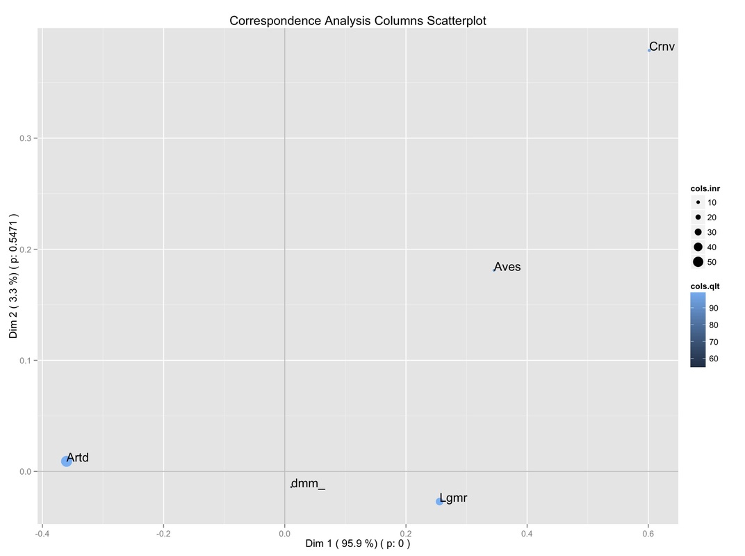
It can be seen that, as usual, the percentage of inertia explained by the Dimensions (selected by the user) is reported. More importantly, the significance of the Dimensions is reported as well, according to the results of the Malinvaud's Test (discussed earlier in this site).
Further, the size of the points is proportional to their contribution to the total inertia (expressed as %). Moreover, the quality of the display (again, as %) on the sub-space defined by these Dimensions is indicated by the points' color intensity.
So, we can get a glimpse of different relevant information at the same time:
-the first dimension is very important (since it explains the majority of the table's inertia);
-it is significant as well (p < 0.001);
-two species (Artiodactyl, Lagomorph) have the highest contribution to the overall inertia;
-they have a good display on this plane.
Next, we can consider the following plot:
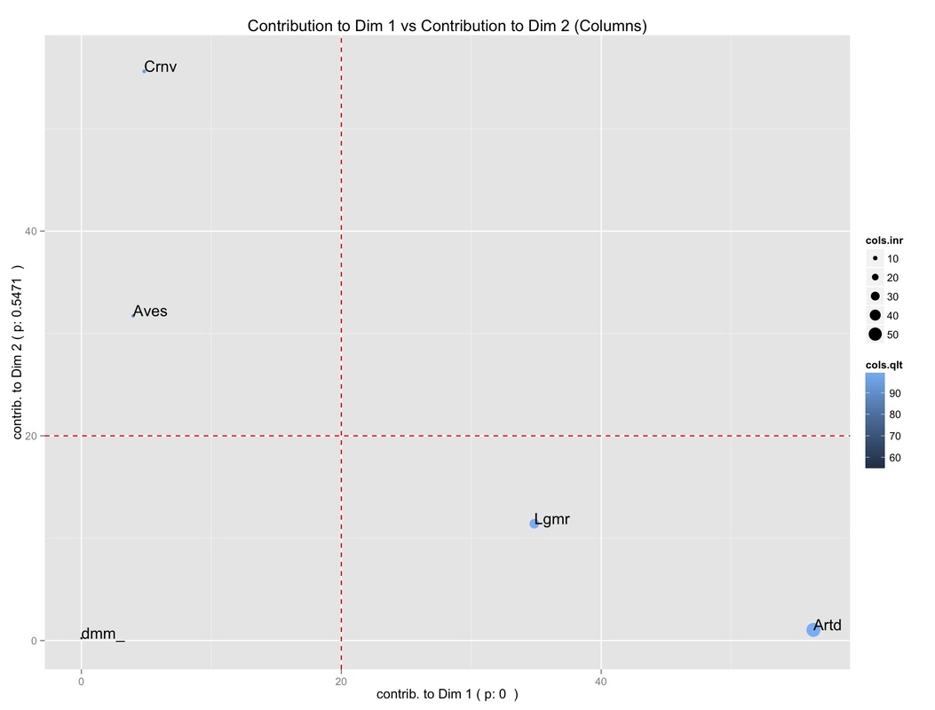
It allows us to get a glimpse of what column categories (i.e., animal species) are actually contributing to the definition of the first two dimensions. Two reference lines (in red) indicate the threshold above which a contribution is worth considering. Again, the points' size is proportional to the contribution to the overall inertia, while the color intensity is proportional to the quality of the display.
So, we can see that:
-Artiodactyl and Lagomorph have a high contribution to the definition of the first Dimension;
-they have, at the same time, a high contribution to the overall inertia;
-they are well displayed;
-Aves and Carnivore have a high contribution to the second dimension instead, but they have a low contribution to the overall inertia.
Next, we can consider the following plot:
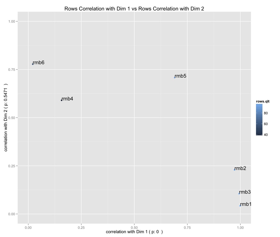
After having understood which column category contribute to the definition of the two Dimensions, we can see from the above plot which Dimension the row categories (i.e., roomblocks) are correlated with. Besides, the points' color intensity indicates the quality of the points display on this plane.
It can be seen that:
-roomblocks 1, 2, 3 are highly correlated with the first Dimension;
-roomblocks 4 and 6 with the second Dimension;
-roomblock 5 lies somewhere in between;
-roomblocks 4 and 6 are the only to have a poor quality of display on this plane.
It can be seen that:
-roomblocks 1, 2, 3 are highly correlated with the first Dimension;
-roomblocks 4 and 6 with the second Dimension;
-roomblock 5 lies somewhere in between;
-roomblocks 4 and 6 are the only to have a poor quality of display on this plane.
Code:
# Start of the Script
suppressPackageStartupMessages(library(ca))
suppressPackageStartupMessages(library(FactoMineR))
suppressPackageStartupMessages(library(ggplot2))
# read data from choosen table
mydata <- read.table(file=file.choose(), header=TRUE)
# get some details about the input table
grandtotal <- sum(mydata)
nrows <- nrow(mydata)
ncols <- ncol(mydata)
numb.dim.cols<-ncol(mydata)-1
numb.dim.rows<-nrow(mydata)-1
a <- min(numb.dim.cols, numb.dim.rows) #dimensionality of the table
# Malinvaud's Test
malinv.ca<-CA(mydata, ncp=a, graph=FALSE)
malinv.test.rows <- a
malinv.test.cols <- 6
malinvt.output <-matrix(ncol= malinv.test.cols, nrow=malinv.test.rows)
colnames(malinvt.output) <- c("K", "Dimension", "Eigen value", "Chi-square", "df", "p value")
malinvt.output[,1] <- c(0:(a-1))
malinvt.output[,2] <- c(1:a)
for(i in 1:malinv.test.rows){
k <- -1+i
malinvt.output[i,3] <- malinv.ca$eig[i,1]
malinvt.output[i,5] <- (nrows-k-1)*(ncols-k-1)
}
malinvt.output[,4] <- rev(cumsum(rev(malinvt.output[,3])))*grandtotal
malinvt.output[,6] <- round(pchisq(malinvt.output[,4], malinvt.output[,5], lower.tail=FALSE), digits=6)
optimal.dimensionality <- length(which(malinvt.output[,6]<=0.05))
# build a dataframe selecting from the malinvt.output matrix, and plot the Malinvaud's test Plot
malinvt.outp.df <- data.frame(dim=malinvt.output[,2], p=malinvt.output[,6])
malinvt.chart <- ggplot(malinvt.outp.df, aes(x=dim, y=p)) + geom_line() + geom_point() + geom_hline(yintercept=0.05, line, colour="red") + ggtitle("Malinvaud's Test Plot") + xlab("Dimensions") + ylab("p value")
#print the Malinvaud's test Plot
dev.new()
print(malinvt.chart)
# prompt to enter the dimnesions to be plotted
cat("Enter the two Dimensions you wish to plot:")
answer <-scan("",n=2,what=integer())
min.dim <- min(answer)
max.dim <- max(answer)
# get the significance of the selected dimensions, to be used in the ggplot charts as labels
sig.1dim <- round(malinvt.output[min.dim, 6], digits=4)
sig.2dim <- round(malinvt.output[max.dim, 6], digits=4)
# get the percentage of inertia explained by the dimensions to be used in ggplot charts (p1, p4)
percent.inr.1dim <- round(malinv.ca$eig[min.dim,2], digits=1)
percent.inr.2dim <- round(malinv.ca$eig[max.dim,2], digits=1)
# get the average categories contribution to be used as reference line in ggplot charts (p2, p5)
aver.row.contrib <- round((100/nrows), digits=0) #for rows
aver.col.contrib <- round((100/ncols), digits=0) #for columns
# perform CA w/ 'ca' package
res.ca <- summary(ca(mydata))
# get the row and columns names from the 'ca' package's dataframe
rownames <- res.ca$rows[,1]
colnames <- res.ca$columns[,1]
# get data for Rows
rows.k1 <- malinv.ca$row$coord[,min.dim]
rows.k2 <- malinv.ca$row$coord[,max.dim]
rows.inertia <- malinv.ca$row$inertia/sum(malinv.ca$row$inertia)*100
rows.qlt <- (malinv.ca$row$cos2[, min.dim]+malinv.ca$row$cos2[, max.dim])*100
rows.ctr1<- malinv.ca$row$contrib[,min.dim]
rows.ctr2 <- malinv.ca$row$contrib[,max.dim]
rows.corr1 <- sqrt(malinv.ca$row$cos2[,min.dim])
rows.corr2 <- sqrt(malinv.ca$row$cos2[,max.dim])
rows.id <- rep("row", nrows)
# build dataframe for rows to be used w/ ggplot2
row.dat <- data.frame(names=rownames, k1=rows.k1, k2=rows.k2, inr=rows.inertia, qlt=rows.qlt,ctr1=rows.ctr1,ctr2=rows.ctr2, corr1=rows.corr1, corr2=rows.corr2, id=rows.id)
# get data for Columns
cols.k1 <- malinv.ca$col$coord[,min.dim]
cols.k2 <- malinv.ca$col$coord[,max.dim]
cols.inertia <- malinv.ca$col$inertia/sum(malinv.ca$col$inertia)*100
cols.qlt <- (malinv.ca$col$cos2[, min.dim]+malinv.ca$col$cos2[, max.dim])*100
cols.ctr1<- malinv.ca$col$contrib[,min.dim]
cols.ctr2 <- malinv.ca$col$contrib[,max.dim]
cols.corr1 <- sqrt(malinv.ca$col$cos2[,min.dim])
cols.corr2 <- sqrt(malinv.ca$col$cos2[,max.dim])
cols.id <- rep("col", ncols)
# build dataframe for columns to be used w/ ggplot2
col.dat <- data.frame(names=colnames, k1=cols.k1, k2=cols.k2, inr=cols.inertia, qlt=cols.qlt,ctr1=cols.ctr1,ctr2=cols.ctr2, corr1=cols.corr1, corr2=cols.corr2, id=cols.id)
# merge the two dataframes (to be used for rows and columns scatterplot, p7)
merged.data.f <- rbind(row.dat, col.dat)
# set the maximum of rows and columns contribution to be used as axis limits in ggplot2 charts (p2, p5)
max.row.ctr <- max(row.dat[,6], row.dat[,7])
max.col.ctr <- max(col.dat[,6], col.dat[,7])
# row charts
p1 <- ggplot(row.dat, aes(x=k1, y=k2)) + geom_point(aes(color=qlt, size=inr)) + geom_hline(yintercept=0, colour="black", line) + geom_vline(xintercept=0, colour="black", line) + geom_text(aes(k1, k2, label = names, vjust=0, hjust=0)) + ggtitle("Correspondence Analysis Rows Scatterplot") + xlab(paste("Dim", min.dim, "(", percent.inr.1dim, "%)", "( p:", sig.1dim,")")) + ylab(paste("Dim", max.dim, "(", percent.inr.2dim, "%)","( p:", sig.2dim,")"))
p2 <- ggplot(row.dat, aes(x=ctr1, y=ctr2)) + geom_point(aes(color=qlt, size=inr)) + geom_text(aes(ctr1,ctr2, label=names, vjust=0, hjust=0)) + geom_hline(yintercept=aver.row.contrib, line, colour="red") + geom_vline(xintercept=aver.row.contrib, line, colour="red") + scale_x_continuous(limits = c(0, max.row.ctr)) + scale_y_continuous(limits = c(0, max.row.ctr)) + ggtitle(paste("Contribution to Dim", min.dim, "vs Contribution to Dim", max.dim,"(Rows)")) + xlab(paste("contrib. to Dim", min.dim, "( p:", sig.1dim," )")) + ylab(paste("contrib. to Dim", max.dim, "( p:", sig.2dim," )"))
p3 <- ggplot(col.dat, aes(x=corr1, y=corr2)) + geom_point(aes(color=qlt)) + geom_text(aes(corr1,corr2, label=names, vjust=0, hjust=0)) + scale_x_continuous(limits = c(0.0, 1.0)) + scale_y_continuous(limits = c(0.0, 1.0)) + ggtitle(paste("Columns Correlation with Dim", min.dim, "vs Columns Correlation with Dim", max.dim)) + xlab(paste("correlation with Dim", min.dim, "( p:", sig.1dim," )")) + ylab(paste("correlation with Dim", max.dim, "( p:", sig.2dim," )"))
# columns charts
p4 <- ggplot(col.dat, aes(x=k1, y=k2)) + geom_point(aes(color=qlt, size=inr)) + geom_hline(yintercept=0, colour="black", line) + geom_vline(xintercept=0, colour="black", line) + geom_text(aes(k1, k2, label = names, vjust=0, hjust=0)) + ggtitle("Correspondence Analysis Columns Scatterplot") + xlab(paste("Dim", min.dim, "(", percent.inr.1dim, "%)", "( p:", sig.1dim,")")) + ylab(paste("Dim", max.dim, "(", percent.inr.2dim, "%)","( p:", sig.2dim,")"))
p5 <- ggplot(col.dat, aes(x=ctr1, y=ctr2)) + geom_point(aes(color=qlt, size=inr)) + geom_text(aes(ctr1,ctr2, label=colnames, vjust=0, hjust=0)) + geom_hline(yintercept=aver.col.contrib, line, colour="red") + geom_vline(xintercept=aver.col.contrib, line, colour="red") + scale_x_continuous(limits = c(0, max.col.ctr)) + scale_y_continuous(limits = c(0, max.col.ctr)) + ggtitle(paste("Contribution to Dim", min.dim, "vs Contribution to Dim", max.dim,"(Columns)")) + xlab(paste("contrib. to Dim", min.dim, "( p:", sig.1dim," )")) + ylab(paste("contrib. to Dim", max.dim, "( p:", sig.2dim," )"))
p6 <- ggplot(row.dat, aes(x=corr1, y=corr2)) + geom_point(aes(color=qlt)) + geom_text(aes(corr1,corr2, label=names, vjust=0, hjust=0)) + scale_x_continuous(limits = c(0.0, 1.0)) + scale_y_continuous(limits = c(0.0, 1.0)) + ggtitle(paste("Rows Correlation with Dim", min.dim, "vs Rows Correlation with Dim", max.dim)) + xlab(paste("correlation with Dim", min.dim, "( p:", sig.1dim," )")) + ylab(paste("correlation with Dim", max.dim, "( p:", sig.2dim," )"))
p7 <- ggplot(merged.data.f, aes(x=k1, y=k2)) + geom_point(aes(color=qlt, size=inr, shape=id)) + geom_hline(yintercept=0, colour="black", line) + geom_vline(xintercept=0, colour="black", line) + geom_text(aes(k1, k2, label = names, vjust=0, hjust=0)) + ggtitle("Correspondence Analysis Rows and Cols Scatterplot") + xlab(paste("Dim", min.dim, "(", percent.inr.1dim, "%)", "( p:", sig.1dim,")")) + ylab(paste("Dim", max.dim, "(", percent.inr.2dim, "%)","( p:", sig.2dim,")"))
#print the charts
dev.new()
print(p1)
print(p2)
print(p3)
dev.new()
print(p4)
print(p5)
print(p6)
dev.new()
print(p7)
# End of the Script
Have you found this website helpful? Consider to leave a comment in this page.
