Assembling the whole picture
|
From the preceding guidelines it should be apparent that by means of CA we may have a clearer and richer picture of the patterns of association between sites and type and, more importantly, we can dissect patterns of variations encoded in our data. CA allowed the isolation of two main trends (i.e., dimensions) of variation in our dataset, with the first being far more important in that it accounts for more than half the total data variability (i.e., inertia). The first two dimensions together explain almost 90% of the inertia (actually, 88.3%).
It has been possible to assess that the first dimension is determined by the opposition between type F (positive pole), on the one hand, and C and G (negative pole) on the other. The second dimension (accounting for a lesser amount of variability) is determined by the opposition between G (positive pole) and C (negative pole). It is now possible to interpret the position of the sites relative to the dimensions in terms of the different influence of each dimension (i.e., pottery types) on the sites. The more they lie on the right (the positive side of the first dimension) the more they will be “associated” with type F or, put another way, the more type F will make an high proportion in their assemblages. This does not mean that sites on that side of the plot will not have type A and D. It does mean, however, that the proportion of type F will be greater than one of the other two types. The more the sites will lie to the left (negative pole of the first dimension), the more they will be “associated” with types G and C.Moreover,withrespecttotheseconddimension,the more the sites lie in the upper part the plot, the more they will be correlated to type G, while type C will make a higher proportion in the assemblages of the sites lying in the lower part of the plot.
As seen, site 2, 4, 10, and 11 have a high correlation with the first dimension (i.e., type F). It is possible to take a look at the table of row profiles to see that in those sites a higher-than-average proportion of type F is present.
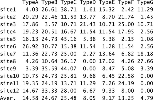
The only exception is site 6, which is displayed near the previous four site points even if that pottery type makes a proportion lower than the average. The reason is that site 6 is not well displayed by the first two dimensions, as seen. As for the other sites, 5, 9, and 12 have a high correlation with the negative pole of the second dimension (i.e., type C) and, accordingly, show a higher-than-average proportion of that particular type. Finally, site 1, 7, and 8 are highly correlated with the first (negative pole) and second (positive pole), both determined by type G, which makes a higher proportion on these sites.
It has to be noted that the Standard Biplot also gives an idea of the relative frequency of a given pottery type in the sites’ assemblages. This is one of the advantages. For example, consider the imaginary axis to which the arrow representing the type G belongs, and let us line up on it the projections of the row profile points. The profile points whose projection intersects the axis on the same side of the arrow are those having a higher-than-average proportion of that pottery type. Those intersecting the axis on the opposite side are those having a lower-than-average proportion. In addition, the more a projection intersects the axis away from the centroid, the greater will be the difference between the average and the proportion that the pottery type makes on the profiles (Greenacre 2007, 103). For example, taking into account sites 1, 7, and 8, the one whose projection lies further from the origin is site 8, which has the highest proportion of that type (27.66%). The second and third are, respectively, site 7 (18.18%) and 1 (11.29%).
The second advantage of the Standard Biplot comes into play in the presence of outliers. Should outliers be present, since generally they are profiles with a low contribution to the inertia, the Standard Biplot provides the possibility to reduce the distortion in the graphical display (i.e., plotting the outliers too far from the centroid). In fact, in this plot, the smaller the contribution of a category to the definition of the dimensions, the more it will be pulled in toward the centroid.
Have you found this website helpful? Consider to leave a comment in this page.
