Correspondence Analysis in Archaeology
  • Home
  • Guide by worked examples
    • Aim of Correspondence Analysis
    • Association between rows and columns
    • Number of dimensions useful for data interpretation
    • Interpreting the CA scatterplot: dimensions interpretation
    • Interpreting the CA scatterplot (continued): correlation between row profiles and dimensions
    • Quality of the representation
    • Assembling the whole picture
    • Extension: clustering rows and/or columns
    • Another worked example
  • References
  • CA in R
    • CAinterprTools (R package)
    • R function for various CA scatterplots
    • R function for improved CA scatterplot
    • R function for perceptual-map-like CA scatterplot
    • R function for plotting Pareto chart of categories contribution
    • R Script for CA
    • Additional R Script for CA
    • R Script for the Significance of CA's Dimensions
  • Other Tools for Statistics
    • R package for seriation via CA
    • R function for scalar-stress probability calculation
    • R function for post. prob. for different relations btw 2 Bayesian 14C phases
    • R function for Posterior Probability Density plot
    • R function for binary Logistic Regression
    • R function for binary Logistic Regression internal validation
    • R function for optimism-adjusted AUC
    • R function for Brainerd-Robinson similarity coefficient
    • R function for univariate outliers detection
    • R function for plotting Jenks natural breaks classification
    • R function for permutation-based Chi square test of independence
    • R function for permutation t-test
    • R function for visually displaying Mann-Whitney test
    • R function for visually displaying Kruskal-Wallis test
    • Kruskal-Wallis Excel Template
    • Chi-squared Excel Template
    • Excel Template for Robust Statistics
  • GIS
  • Blog
  • About me
  • Guestbook/Comments

Quality of the representation

Finally, the analyst has to take into consideration the fact that not all the points could be well displayed in the chosen dimensions. To assess the quality of the display, he can consult the statistics provided by the ‘ca’ package showing both on the R console and in the textual output of the script, or inspect the bar chart provided by the script itself.
Immagine
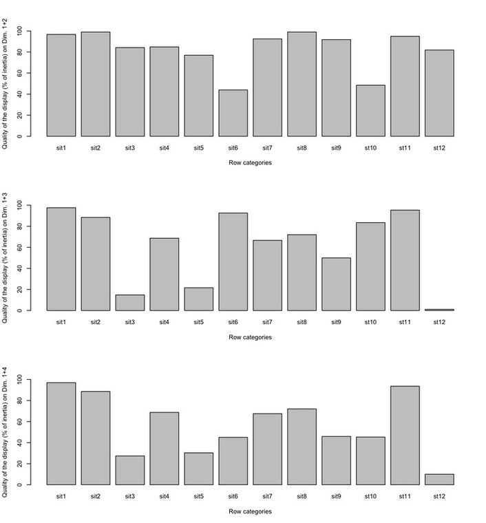
It can be seen that almost all the sites are well displayed by the first two dimensions or, in other words, these dimensions explain the greatest percentage of the inertia of those profiles. Only site 6 and 10 turn out to be poorly displayed, implying that the position of those two points on the scatterplot must be evaluated with caution.
Have you found this website helpful? Consider to leave a comment in this page.
Powered by Create your own unique website with customizable templates.