'ca.percept': R function for perceptual-map-like Correspondence Analysis scatterplot (DOI: 10.13140/RG.2.2.32645.14560)
'ca.percept' is a R function which allows to plot a variant of the traditional Correspondence Analysis scatterplots that allows facilitating the interpretation of the results. In particular, the function aims at producing what in marketing research is called perceptual map (see below).
Note: the function has been integrated into the 'CAinterprTools' package (as of version 0.7) described in this same site (LINK).
This function aims at producing that kind of visual representation of the CA results that seeks to avoid the problem of interpreting inter-spatial distance (M. T. Bendixen, Compositional Perceptual Mapping Using Chi-squared Trees Analysis and Correspondence Analysis, Journal of Marketing Management 11, 1995, 571-581), by plotting only one type of points (say, column points), and "giving names to the axes" corresponding to the major row category contributors to the two selected dimensions.
The function is :
ca.percept(data, x, y, focus, dim.corr, guide)
where:
data is the name of the dataframe containing the cross-tabulation to be analysed;
x and y are the dimensions the analyst is interested in (the default value is 1 and 2 respectively);
focus takes "row" (default) if the interest is in assessing the contribution of the rows to the definition of the dimensions, "col" if the interest is on the columns;
dim.corr is the dimension for which the points' correlation (column points if focus is set to "row", row points if focus is set to "col") will be computed and used as input value for the size of the points. The default value is the smaller of the two input dimensions (i.e., x);
guide takes TRUE or FALSE (default) if the user does or doesn't want the points being given a color code indicating with which of the two selected dimension they have a higher relative correlation.
Example:
Let's consider the dataset used by Bendixen in the aforementined article (dataset in .txt format downloadable HERE):
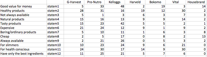
The above table represents the frequencies of response resulting from interviews from 100 housewives from a province in South Africa. Respondents were asked to indicate which of the 7 cereal brands (columns) they associate with the 12 attributes (rows). For labelling reasons, I coded the attributes as statement 1, 2, 3 etc (second column to the left).
The idea beyond the function is to easily get in R the CA scatterplot used by Bendixen in his article (see the image below), and which allows to easily portray the association between cereal brands and attributes. In the plot, only the column categories (i.e., cereal brands) are displayed as points, while the attributes (i.e., the statements) are reported in relation to the displayed axes. Only the statements that determine the axes are retained in the plot.
The idea beyond the function is to easily get in R the CA scatterplot used by Bendixen in his article (see the image below), and which allows to easily portray the association between cereal brands and attributes. In the plot, only the column categories (i.e., cereal brands) are displayed as points, while the attributes (i.e., the statements) are reported in relation to the displayed axes. Only the statements that determine the axes are retained in the plot.
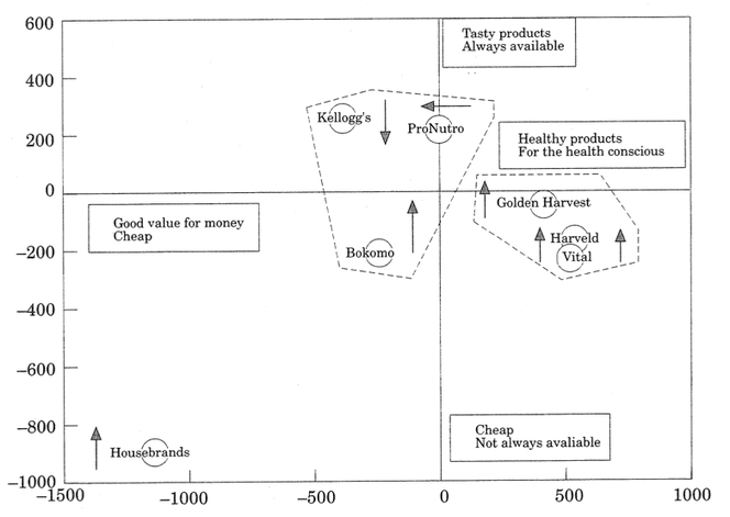
after M. T. Bendixen, Compositional Perceptual Mapping Using Chi-squared Trees Analysis and Correspondence Analysis, Journal of Marketing Management 11, 1995, 571-581
The function allows to get the plot below (click on the picture to download it).
It displays the 1st and 2nd dimension, with the column points (cereal brands) having size proportional to their correlation with the 1st dimension. The labels near the poles of the two axes report the row categories (i.e., the statements) which have a larger-tahn-average contribution to the construction of the two displayed dimensions.
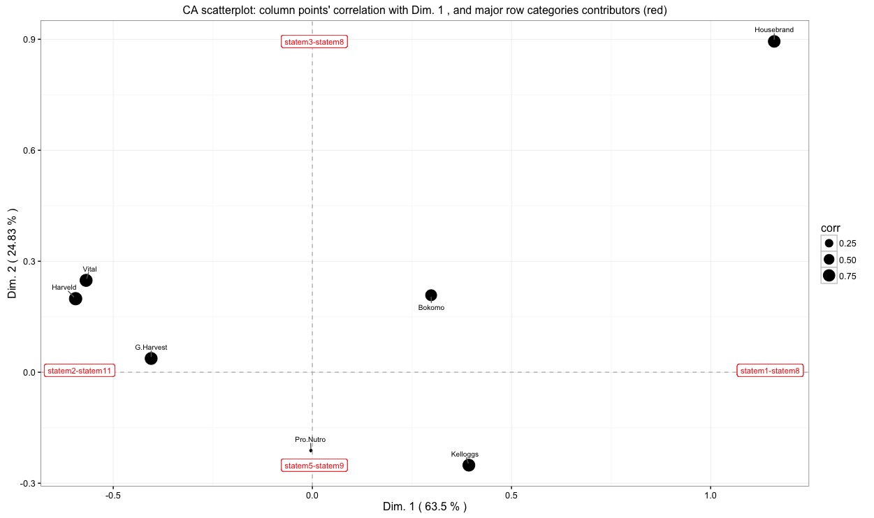
The two plots above are the same, allowing for a different orientation of the overall display. This type of CA visualization allows to isolate which statement is actually contributing to the definition of the dimensions, and to understand which cereal brand is associated to which statement. A more nuanced picture can be obtained by comparing this plot to the one in which points are given size according to their correlation with the second (vertical) dimension.
Below, yet another example is shown (click the picture to download it).
It is based on the dataset used by Kennedy et al, Practical Applications of Correspondence Analysis to Categorical Data in Market Research, in Journal of Targeting Measurement and Analysis for Marketing, 1996. Here, coffee brands are cross-tabulated against attributes given by respondents (dataset available HERE).
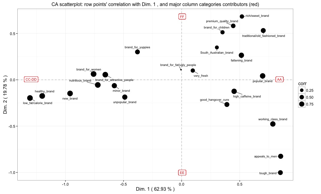
In this plot, axes are given names according to the major contributing column categories (i.e., coffee brands in this datset), while the points correspond to the row categories (i.e., attributes). Points' size is proportional to the correlation of points with the 1st dimension.
If we set the function's parameter guide to TRUE, we get the plot below:
If we set the function's parameter guide to TRUE, we get the plot below:
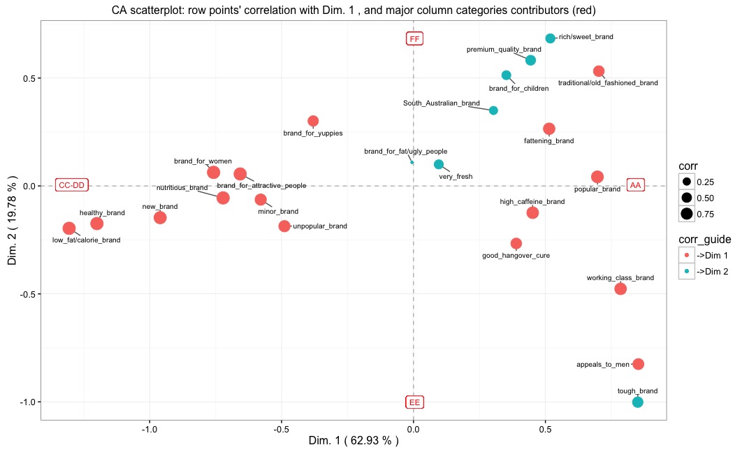
It is similar to the preceding one, but now the points are given colour according to whether they are more correlated (in relative terms) to the first or to the second of the selected dimensions. In this example, points flagged with "->Dim 1" are more correlated to the 1st dimension, while those flagged with "->Dim 2" have a higher correlation with the 2nd dimension.
Finally, the coffee brand example provides the opportunity to clarify that, when dealing with large wordy labels (the attributes in this example), if one wants to use them to give names to the axes it is advisable to shorten them, or substitute them with whatever index makes sense to the analyst. In this example, it makes perfectly sense to use brands (whose labels are very short) to give names to the axes, and displaying the row categories (i.e., attributes) in the space defined by the brands. The opposite would still make sense, but the lengthy row labels would make the axes' labels barely readable.
To load the function into R, just copy and paste the function below into the R console, and press return (or you can download the .R file HERE). Please note that, in order for the function to work, the packages 'ggplot2' and 'ggrepel' must be already installed and loaded into R.
ca.percept <- function (data, x = 1, y = 2, focus="row", dim.corr=x, guide=FALSE) {
ncols <- ncol(data)
nrows <- nrow(data)
numb.dim.cols <- ncol(data) - 1
numb.dim.rows <- nrow(data) - 1
a <- min(numb.dim.cols, numb.dim.rows)
res <- CA(data, ncp=a, graph=FALSE)
percent.inr.xdim <- round(res$eig[x,2], digits=2)
percent.inr.ydim <- round(res$eig[y,2], digits=2)
if (focus=="col") {
pnt_labls <- colnames(data)
title <- paste("CA scatterplot: row points' correlation with Dim.", dim.corr,", and major column categories contributors (red)")
} else {
pnt_labls <- rownames(data)
title <- paste("CA scatterplot: column points' correlation with Dim.", dim.corr, ", and major row categories contributors (red)")
}
if (focus=="col") {
dfr <- data.frame(lab=pnt_labls,coord1=res$col$coord[,x], cntr1=res$col$contrib[,x], coord2=res$col$coord[,y], cntr2=res$col$contrib[,y])
dfr.to.plot <- data.frame(coord1=res$row$coord[,x],coord2=res$row$coord[,y], corr=sqrt(res$row$cos2[,dim.corr]), corr.b=sqrt(res$row$cos2[,ifelse(dim.corr==x,y,x)]))
col.data <<- dfr
row.data <<- dfr.to.plot
} else {
dfr <- data.frame(lab = pnt_labls,coord1=res$row$coord[,x], cntr1=res$row$contrib[,x], coord2=res$row$coord[,y], cntr2=res$row$contrib[,y])
dfr.to.plot <- data.frame(coord1=res$col$coord[,x],coord2=res$col$coord[,y], corr=sqrt(res$col$cos2[,dim.corr]), corr.b=sqrt(res$col$cos2[,ifelse(dim.corr==x,y,x)]))
row.data <<- dfr
col.data <<- dfr.to.plot
}
if (guide==TRUE) {
dfr.to.plot$corr_guide <- ifelse(dfr.to.plot$corr>dfr.to.plot$corr.b,paste("->Dim",dim.corr), paste("->Dim",ifelse(dim.corr==x,y,x)))
} else {}
cntr.thresh <- ifelse(focus=="col", 100/ncols, 100/nrows)
sub1 <- paste(subset(dfr, coord1<0 & cntr1>cntr.thresh)[,1], collapse="-")
sub2 <- paste(subset(dfr, coord1>0 & cntr1>cntr.thresh)[,1], collapse="-")
sub3 <- paste(subset(dfr, coord2<0 & cntr2>cntr.thresh)[,1], collapse="-")
sub4 <- paste(subset(dfr, coord2>0 & cntr2>cntr.thresh)[,1], collapse="-")
length.sub1 <- length(subset(dfr, coord1<0 & cntr1>cntr.thresh)[,1])
length.sub2 <- length(subset(dfr, coord1>0 & cntr1>cntr.thresh)[,1])
length.sub3 <- length(subset(dfr, coord2<0 & cntr2>cntr.thresh)[,1])
length.sub4 <- length(subset(dfr, coord2>0 & cntr2>cntr.thresh)[,1])
max.length <- max(length.sub1, length.sub2, length.sub3, length.sub4)
size.labels <- 6/max.length
size.labels <- ifelse(size.labels>2,size.labels, 2)
x.neg.lim <- min(dfr.to.plot$coord1)
x.pos.lim <- max(dfr.to.plot$coord1)
y.neg.lim <- min(dfr.to.plot$coord2)
y.pos.lim <- max(dfr.to.plot$coord2)
p <- ggplot(dfr.to.plot, aes(x=coord1, y=coord2)) + theme_bw() + xlab(paste("Dim.",x,"(",percent.inr.xdim,"% )" )) + ylab(paste("Dim.",y, "(", percent.inr.ydim, "% )")) + geom_hline(yintercept = 0, colour="grey", linetype = "dashed") + geom_vline(xintercept = 0, colour="grey", linetype = "dashed") + geom_label(x=x.neg.lim+0.01, y=0.005, label=sub1, colour = "red", size=size.labels) + geom_label(x=x.pos.lim-0.01, y=0.005, label=sub2, colour="red", size=size.labels) + geom_label(x=0.005, y=y.neg.lim, label=sub3, colour="red",size=size.labels) + geom_label(x=0.005, y=y.pos.lim, label=sub4, colour="red",size=size.labels) + geom_text_repel(data = dfr.to.plot, aes(label = rownames(dfr.to.plot)), size = 2.7, colour = "black", box.padding = unit(0.35, "lines"), point.padding = unit(0.3, "lines")) + ggtitle(title) + theme(plot.title = element_text(size = 12))
if (guide==TRUE) {
p1 <- p + geom_point(aes(size=corr, colour=corr_guide))
} else {
p1 <- p + geom_point(aes(size=corr))
}
return(p1)
}
Have you found this website helpful? Consider to leave a comment in this page.
