'ca.scatter': R function for plotting different types of Correspondence Analysis scatterplots
'ca.scatter' is an R function which allows to plot different types of Correspondence Analysis scatterplots. It depends on the 'ca' and 'FactoMineR' packages, and aims at making easier to obtain some of the interesting charts provided by those two amazing packages. Users are refereed to the aforementioned packages in case they want greater control of some settings. Note: the function has been integrated in the 'CAinterprTools' package (as of version 0.5) described in this same site (LINK).
As for the rationale and context of use of the returned charts, users are referred to the documentation of 'ca' and 'FactoMineR' packages. Information can also be found both in this same site and in my 2013 article on Archeologia e Calcolatori journal. For perceptual map-like scatterplots, also check my function described in this same site (LINK).
As for the rationale and context of use of the returned charts, users are referred to the documentation of 'ca' and 'FactoMineR' packages. Information can also be found both in this same site and in my 2013 article on Archeologia e Calcolatori journal. For perceptual map-like scatterplots, also check my function described in this same site (LINK).
The function is quite straightforward:
ca.scatter(data, x, y, type)
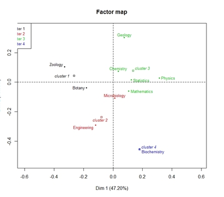
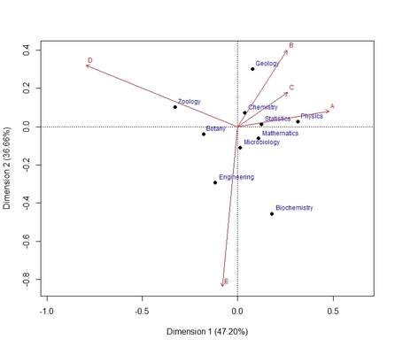
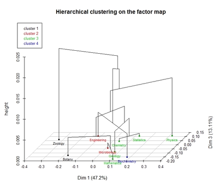
where data is the input dataset, x and y are the dimensions of interest, and type is a number (from 1 to 4) which indicates the desired type of scatterplot (see also the figures below, for which the 'greenacre_data' dataset has been used):
-type=1: regular scatterplot for rows and columns
-type=2: Standard Biplot (2 plots are returned: one with row-categories vectors displayed, one for columns-categories vectors)
-type=3: scaterplot of row categories with groupings shown by different colors; scatterplot for column categories is also returned
-type=4: 3D scatterplot with cluster tree for row categories; scatterplot for column categories is also returned.
ca.scatter(data, x, y, type)
where data is the input dataset, x and y are the dimensions of interest, and type is a number (from 1 to 4) which indicates the desired type of scatterplot (see also the figures below, for which the 'greenacre_data' dataset has been used):
-type=1: regular scatterplot for rows and columns
-type=2: Standard Biplot (2 plots are returned: one with row-categories vectors displayed, one for columns-categories vectors)
-type=3: scaterplot of row categories with groupings shown by different colors; scatterplot for column categories is also returned
-type=4: 3D scatterplot with cluster tree for row categories; scatterplot for column categories is also returned.
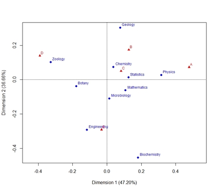
type=1
type=3
|
type=2
type=4
|
To load the function into R, just copy and paste the function below into the R console, and press return (or you can download the .R file HERE):
ca.scatter <- function(data,x,y,type){
numb.dim.cols<-ncol(data)-1
numb.dim.rows<-nrow(data)-1
dimensionality <- min(numb.dim.cols, numb.dim.rows)
res.ca <- ca(data)
ca.factom <- CA(data, ncp=dimensionality, graph=FALSE)
resclust.rows<-HCPC(ca.factom, nb.clust=-1, metric="euclidean", method="ward", order=TRUE, graph.scale="inertia", graph=FALSE, cluster.CA="rows")
resclust.cols<-HCPC(ca.factom, nb.clust=-1, metric="euclidean", method="ward", order=TRUE, graph.scale="inertia", graph=FALSE, cluster.CA="columns")
if (type==1) {
plot.CA(ca.factom, axes=c(x,y), autoLab = "auto", cex=0.75)
} else {
if (type==2) {
plot(res.ca, mass = FALSE, dim=c(x,y), contrib = "none", col=c("black", "red"), map ="rowgreen", arrows = c(FALSE, TRUE)) #for rows
plot(res.ca, mass = FALSE, dim=c(x,y), contrib = "none", col=c("black", "red"), map ="colgreen", arrows = c(TRUE, FALSE)) #for columns
} else {
if (type==3) {
plot(resclust.rows, axes=c(x,y), choice="map", draw.tree=FALSE, ind.names=TRUE, new.plot=TRUE)
plot(resclust.cols, axes=c(x,y), choice="map", draw.tree=FALSE, ind.names=TRUE, new.plot=TRUE)
} else {
if (type==4) {
plot(resclust.rows, axes=c(x,y), choice="3D.map", draw.tree=TRUE, ind.names=TRUE, new.plot=TRUE)
plot(resclust.cols, axes=c(x,y), choice="3D.map", draw.tree=TRUE, ind.names=TRUE, new.plot=TRUE)
}
}
}
}
}
Final note:
in order for the function to work, the 'ca' and 'FactoMineR' packages must be installed in R.
in order for the function to work, the 'ca' and 'FactoMineR' packages must be installed in R.
Have you found this website helpful? Consider to leave a comment in this page.
