'pareto.contrib': R function for plotting a pareto chart for row/column categories contribution to dimensions
'pareto.contrib' is an R function which allows to plot the contribution of row/column categories to any given CA dimension as a Pareto chart. It depends on the 'qcc' package, which of course must be installed into R before running the function.
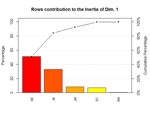
The chart returned by the function proves useful in quickly spotting which categories have an higher (in relative terms) contribution to a given dimension, and which percentage of the inertia of a given dimension groups of categories are cumulatively explaining.
The chart returned by the function proves useful in quickly spotting which categories have an higher (in relative terms) contribution to a given dimension, and which percentage of the inertia of a given dimension groups of categories are cumulatively explaining.
The function is quite straightforward:
pareto.contrib(data, type, x, which)
where data is the input dataset,
type indicates whether the input dataset is a contingency table (value to enter would be: "table") or an object returned by FactoMineR's CA() function (value to enter would be: "obj"),
x is dimensions of interest,
which indicates whether the user is interested in row ("R") or column ("C") categories.
Example:
Let's load the "smoke" dataset coming with the 'ca' package:
library(ca)
data(smoke)
To get the Pareto chart of the contribution of row categories to the first dimension, we use the following code:
pareto.contrib(smoke, type="table", 1, which="R")
The output is reproduced below:
To load the function into R, just copy and paste the function below into the R console, and press return (or you can download the .R file HERE):
pareto.contrib <- function(data,type,x, which){
if (type=="table"){
numb.dim.cols<-ncol(data)-1
numb.dim.rows<-nrow(data)-1
dimensionality <- min(numb.dim.cols, numb.dim.rows)
res.CA <- CA(data, ncp=dimensionality, graph=FALSE) #requires FactoMineR
if (which=="R") {
cntr= res.CA$row$contrib[,x]
names(cntr) <- rownames(data)
title <- paste("Rows contribution to the Inertia of Dim.", x)
} else {
cntr= res.CA$col$contrib[,x]
names(cntr) <- colnames(data)
title <- paste("Columns contribution to the Inertia of Dim.", x)
}
pareto.chart(cntr, cumperc = seq(0, 100, by = 20), ylab="Percentage", main=title, cex.axis=0.8, cex.names=0.8) #requires qcc
}else{
if (type=="obj"){
res.CA <- data
if (which=="R") {
cntr= res.CA$row$contrib[,x]
names(cntr) <- rownames(res.CA$row$contrib)
title <- paste("Rows contribution to the Inertia of Dim.", x)
} else {
cntr= res.CA$col$contrib[,x]
names(cntr) <- rownames(res.CA$col$contrib)
title <- paste("Columns contribution to the Inertia of Dim.", x)
}
pareto.chart(cntr, cumperc = seq(0, 100, by = 20), ylab="Percentage", main=title, cex.axis=0.8, cex.names=0.8) #requires qcc
}
}
}
Final note:
remember that in order for the function to work, the 'qcc' package must be installed in R.
remember that in order for the function to work, the 'qcc' package must be installed in R.
Have you found this website helpful? Consider to leave a comment in this page.
