'plot.kw': R function for visually displaying Kruskal-Wallis test's results (DOI: 10.13140/RG.2.1.5155.0489)
'plot.kw' is an R function which allows to perform Kruskal-Wallis test, and to display the test's results in a plot along with boxplots. A sample dataset (in .txt format) can be downloaded HERE. The dataset contains some measurements in the first column, and a grouping variable in the second one. This is the format in which data must be fed into the function.
The function is quite straightforward:
plot.kw(data, strip, notch, omm, outl, posthoc, adjust)
where
data: is the dataframe containing the data (arranged according to what has been described just few lines above);
strip: is a logical value that takes TRUE or FALSE (default) if the user does or does not want that a strip chart (i.e., jittered points representing the individual observations) will be displayed along with the boxplots;
notch: is a logical value which takes FALSE (default) or TRUE if user does not or does want to have notched boxplots in the final display, respectively; note that overlapping of notches indicates a not significant difference at about 95% confidence (see McGill R, Tukey JW, Larsen WA, Variations of Box Plots, in The American Statistician 32 (1978): 12–16);
omm: (which stands for overall mean and median) takes FALSE (default) or TRUE if user wants the mean and median of the overall sample plotted in the chart (as a dashed RED line and dotted BLUE line respectively);
outl: is a logical value that takes TRUE (default) or FALSE if the user does or does not want outlying values to be displayed along with the boxplots;
posthoc: is a logical value which takes FALSE (default) or TRUE if user does not or does want to perform a follow-up test (namely, the Dunn's test) in order to locate which group significantly differs from the others;
adjust: it sets the desidered method for p-values adjustment in the context of the Dunn's test; the list of methods is the following: Bonferroni ("bonferroni"; default); Holm ("holm"), Hochberg ("hochberg"), Hommel ("hommel"), Benjamini & Hochberg ("BH" or its alias "fdr"), Benjamini & Yekutieli ("BY"), none ("none"). For more info, see the p.adjust's help documentation in R (?p.adjust).
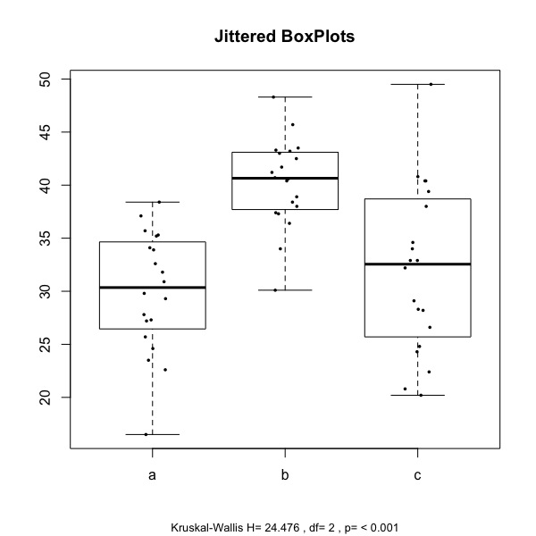
With reference to the illustrative dataset cited above, the function allows to get the plots below:
the one to the left is obtained with: plot.kw(mydata, strip=TRUE, notch=FALSE, omm=FALSE, posthoc=TRUE, adjust="bonferroni")
the one to the right is obtained with: plot.kw(mydata, strip=TRUE, notch=TRUE, omm=FALSE, posthoc=TRUE, adjust="bonferroni")
The function is quite straightforward:
plot.kw(data, strip, notch, omm, outl, posthoc, adjust)
where
data: is the dataframe containing the data (arranged according to what has been described just few lines above);
strip: is a logical value that takes TRUE or FALSE (default) if the user does or does not want that a strip chart (i.e., jittered points representing the individual observations) will be displayed along with the boxplots;
notch: is a logical value which takes FALSE (default) or TRUE if user does not or does want to have notched boxplots in the final display, respectively; note that overlapping of notches indicates a not significant difference at about 95% confidence (see McGill R, Tukey JW, Larsen WA, Variations of Box Plots, in The American Statistician 32 (1978): 12–16);
omm: (which stands for overall mean and median) takes FALSE (default) or TRUE if user wants the mean and median of the overall sample plotted in the chart (as a dashed RED line and dotted BLUE line respectively);
outl: is a logical value that takes TRUE (default) or FALSE if the user does or does not want outlying values to be displayed along with the boxplots;
posthoc: is a logical value which takes FALSE (default) or TRUE if user does not or does want to perform a follow-up test (namely, the Dunn's test) in order to locate which group significantly differs from the others;
adjust: it sets the desidered method for p-values adjustment in the context of the Dunn's test; the list of methods is the following: Bonferroni ("bonferroni"; default); Holm ("holm"), Hochberg ("hochberg"), Hommel ("hommel"), Benjamini & Hochberg ("BH" or its alias "fdr"), Benjamini & Yekutieli ("BY"), none ("none"). For more info, see the p.adjust's help documentation in R (?p.adjust).
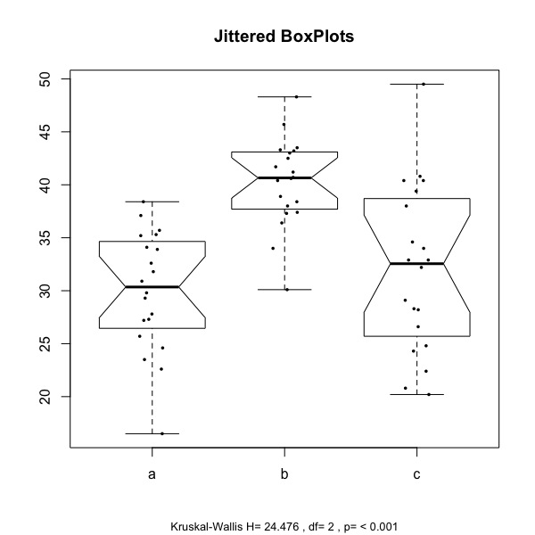
With reference to the illustrative dataset cited above, the function allows to get the plots below:
the one to the left is obtained with: plot.kw(mydata, strip=TRUE, notch=FALSE, omm=FALSE, posthoc=TRUE, adjust="bonferroni")
the one to the right is obtained with: plot.kw(mydata, strip=TRUE, notch=TRUE, omm=FALSE, posthoc=TRUE, adjust="bonferroni")
|
|
The boxplots display the distribution of the values of the two samples (here labelled a, b, and c), and jittered points represent the individual observations. At the bottom of the chart, the test statistics (H) is reported, along with the degrees of freedom and the associated p value.
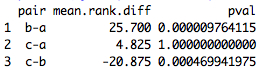
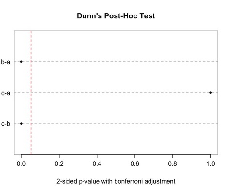
Since the parameter posthoc is set to TRUE, the Dunn's test is performed (with Bonferroni adjustment): a dot chart is returned, as well as a list of p-values (2-sided) in the R console. In the dot chart, a RED line indicates the 0.05 threshold. The groups compared on a pairwise basis are indicated on the left-hand side of the chart.
Since the parameter posthoc is set to TRUE, the Dunn's test is performed (with Bonferroni adjustment): a dot chart is returned, as well as a list of p-values (2-sided) in the R console. In the dot chart, a RED line indicates the 0.05 threshold. The groups compared on a pairwise basis are indicated on the left-hand side of the chart.
|
|
Please note that, in order for the function to work, the packages 'DescTools' and 'Hmisc' must be already installed in R.
|
You can get the function via a small donation (about a couple of USD) -------------->
|
|
Upon making your donation, please do not forget to provide your preferred email contact where you will receive the file.
Have you found this website helpful? Consider to leave a comment in this page.
